If you’re preparing for the IELTS exam, you might have wondered: What does a Band 9 Task 1 response actually look like? Writing Task 1 is often underestimated, but it plays a huge role in your overall Writing score. In this post, we’ll look at what makes a top-scoring response, and we’ll walk through a real Band 9 example so you can see exactly how it’s done.
What Is IELTS Writing Task 1?
In Task 1, you are asked to summarise visual information in at least 150 words. The charts may include:
- Bar charts
- Line graphs
- Pie charts
- Tables
- Maps
- Processes
You’re assessed on four criteria:
- Task Achievement
- Coherence and Cohesion
- Lexical Resource
- Grammatical Range and Accuracy
To achieve Band 9, you need to:
- Present a clear overview,
- Detailed description,
- Describe precisely,
- Excellent grammar.
Band 9 Task 1 Example
You should spend about 20 minutes on this task.
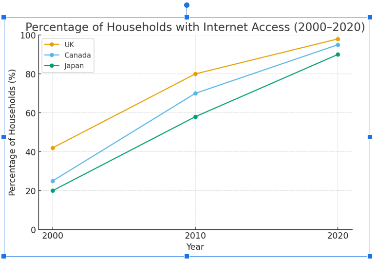
The chart below shows the percentage of households in three countries (the UK, Japan, and Canada) that had internet access between 2000 and 2020.
Band-9 Model Answer
The bar chart illustrates the proportion of households with internet access in the United Kingdom, Japan, and Canada from 2000 to 2020. Overall, internet penetration increased steadily in all three countries, with the UK maintaining the highest levels throughout the period. By contrast, Japan consistently lagged behind, although the gap narrowed by the end of the period.
In 2000, just over 40% of UK households had internet access compared to approximately 25% in Canada and 20% in Japan. Over the following decade, access expanded rapidly. By 2010, the figures for the UK and Canada had risen gradually to around 80% and 70% respectively, while Japan reached just under 60%.
The most significant growth occurred between 2010 and 2020, when all three nations had near-universal access. The UK reached roughly 98%, followed closely by Canada at 95%. Japan also saw considerable progress, with 90% of households connected by 2020.
Explanation for Band-9:
• Task Response: All aspects of this report are excellent. There is a very clear structure, the language use is extremely precise, the punctuation is clear and there are precise sentences. There is nothing that a reader would find confusing. Furthermore, there aren’t any unnecessary words, all the words used in the task are necessary for completing the task. The description is so precise that the examiner wouldn’t need to look at the chart to know exactly what the chart looks like.
• Coherence and Cohesion: All the key details are described and nothing important is left out of the description. There is a precise description of everything in the chart and then an overall description of the trends. All the information is clearly signposted for the examiner.
• Lexical Resource: Excellent use of precise vocabulary at all times that would be extremely difficult to improve. Words are used to maximum communicative effect and every word is crucial for describing the chart.
• Grammar and Accuracy: Not only is this 100% error free but also the grammar is used precisely to help the reader understand what the chart looks like.
Do you want to achieve Band 9?
Join our community for free weekly practice activities.

Thanks you for this good job.